Chocolate, without the small print.
A protein bar brand that refused to look like a supplement.
- Client
- Delly
- Year
- 2025
- Scope
- Brand identity, Packaging, Digital product imagery, Social content
The problem
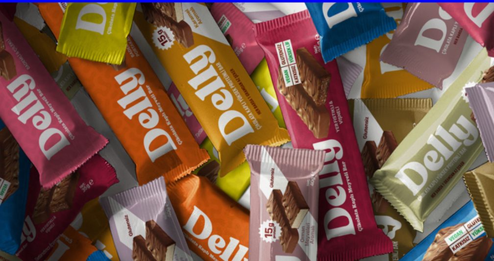
Protein bars sell function: grams, percentages, a matte black wrapper and a promise about your body. Delly had a better recipe than most, with nothing artificial, but a shelf full of look-alikes to fight through. The brief was to be picked up before being read.

A snack first. A protein bar second.
The idea
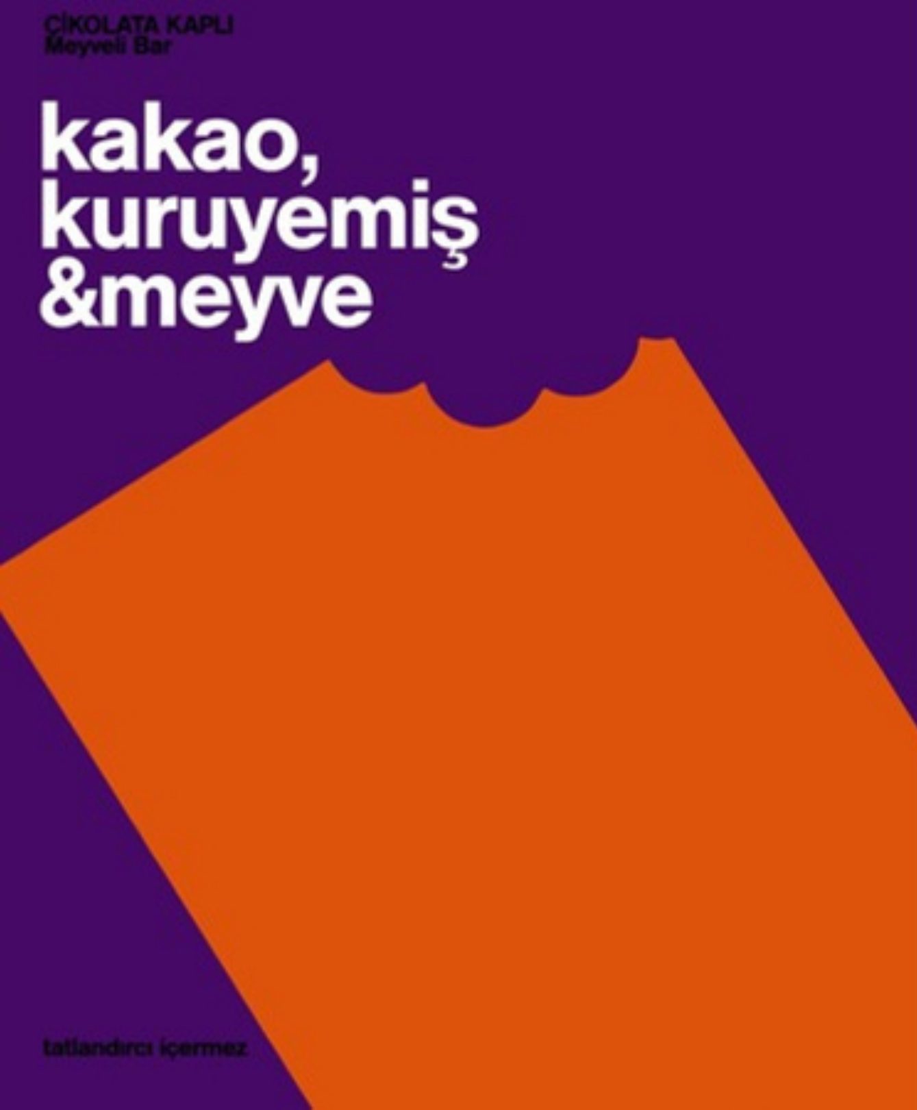
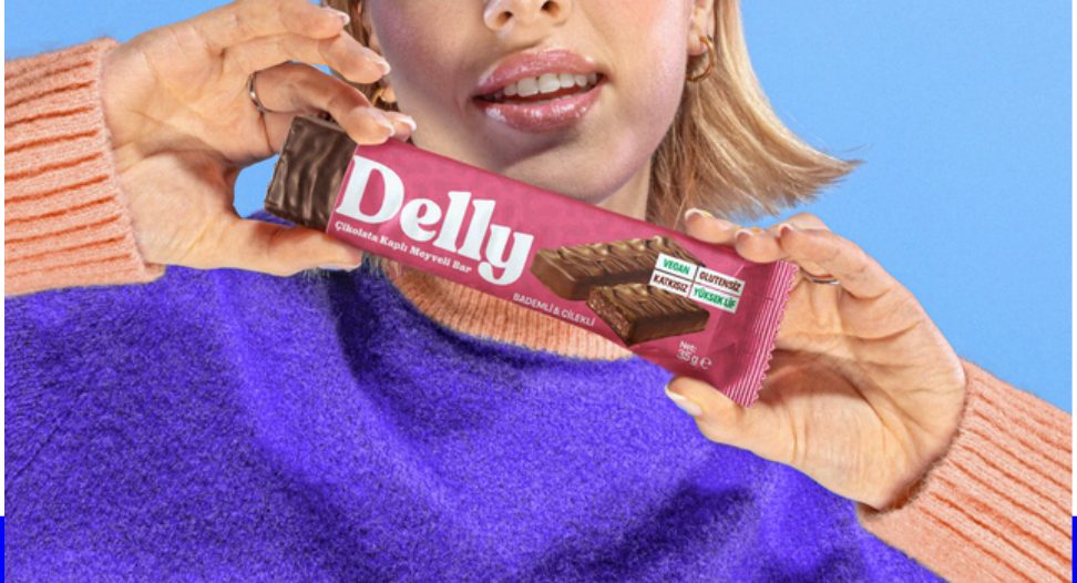
We borrowed the confidence of confectionery. A soft, rounded wordmark that reads like a friend's handwriting. One saturated wrapper colour per flavour, so the range reads as a family from across the aisle and as individuals up close. The nutrition facts stayed honest and moved to the side, where they belong.
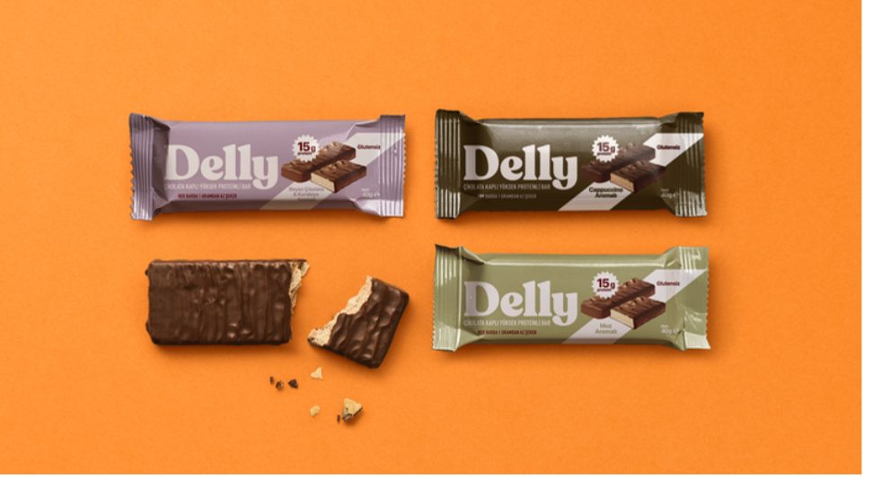
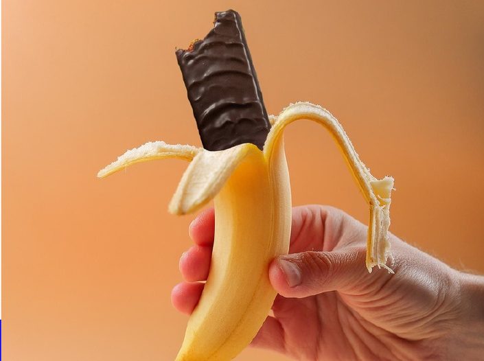
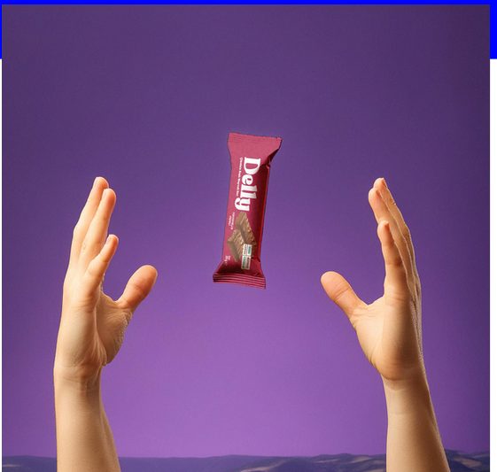
Every image plays with its food instead of posing it.
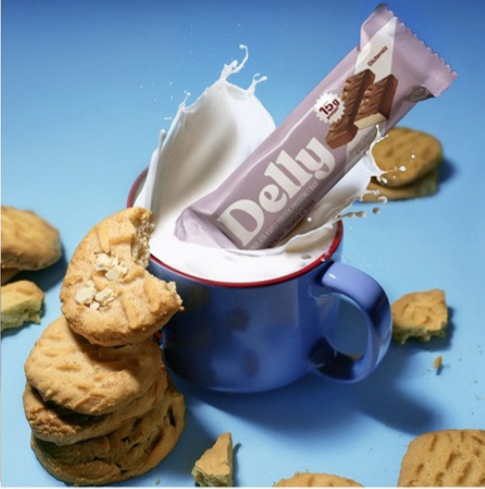
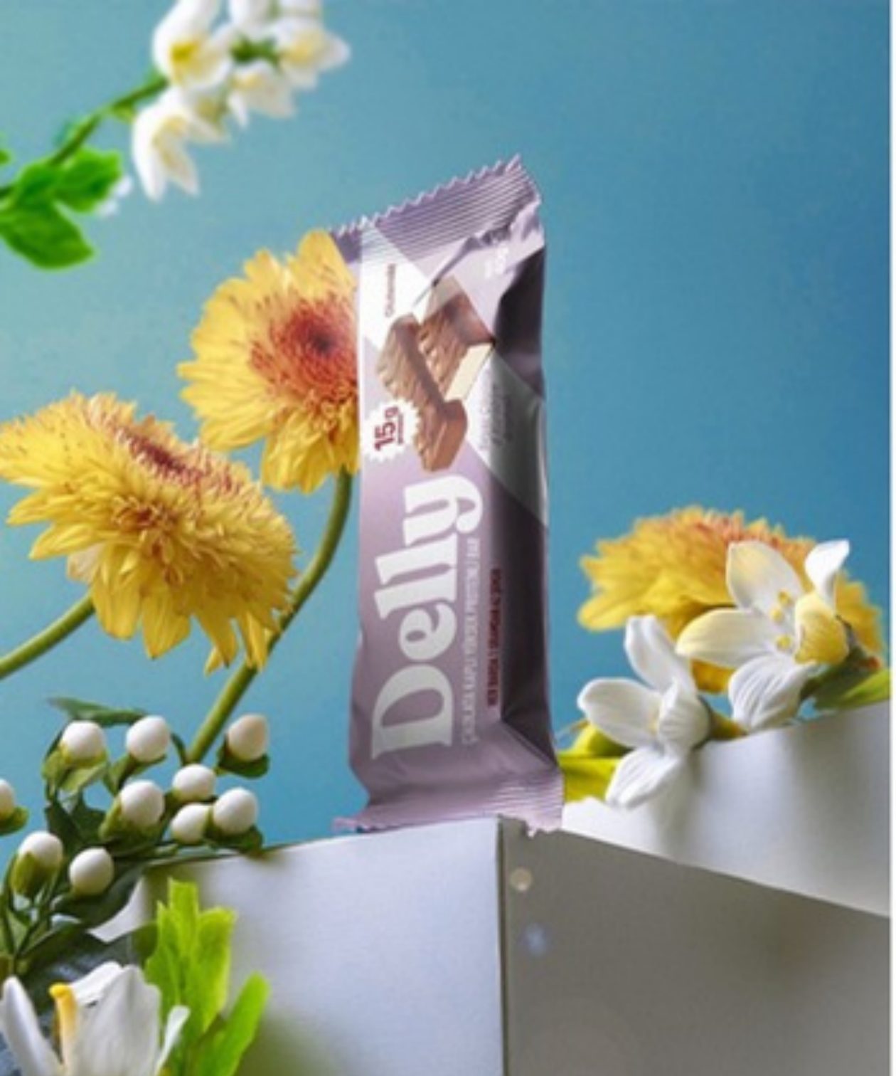
Product imagery
Instead of a studio shoot per flavour, we built a digital image system: the same bar, dropped into scenes with real appetite. Milk, bananas, biscuits, flowers. Fast to extend when a new flavour launches, and consistent across the feed, the shelf talker and the website hero.
Sophie London